飯飯堂|品牌識別與餐飲視覺
Fan Fan Tang — Brand Identity & Food Visual Design
Fan Fan Tang — Brand Identity & Food Visual Design
Brand Identity
Visual System
Packaging Design
Menu Design
Poster Design
Print Production
Visual System
Packaging Design
Menu Design
Poster Design
Print Production
飯飯堂是一個以沖繩風格飯糰為核心的餐飲品牌。不同於常見的圓形飯糰,沖繩飯糰以方形外型包裹米飯、SPAM 午餐肉、蛋與蔬菜,具有更完整的內容與飽足感。品牌希望呈現乾淨、適合社群傳播的形象,Redeworks 則在此基礎上加入沖繩飯糰的結構、食材特色與職人感,讓品牌不只停留在外觀上的清爽,也能傳達餐點本身的份量與個性。
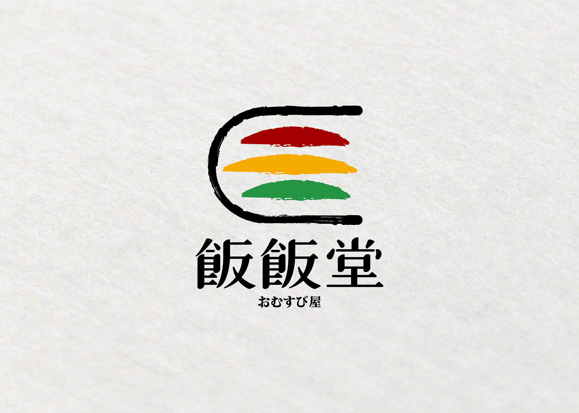
品牌標誌以沖繩飯糰的側面輪廓為基礎,透過海苔包覆飯體的形象,建立簡潔而具辨識度的品牌符號。三條橫向色帶分別代表 SPAM 午餐肉、蛋與蔬菜,米白色則對應飯糰本身的米飯;延伸出的色彩與輪廓紋樣,也成為品牌應用中的視覺元素。
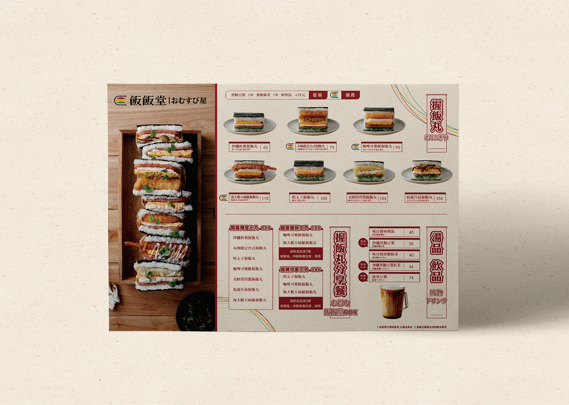
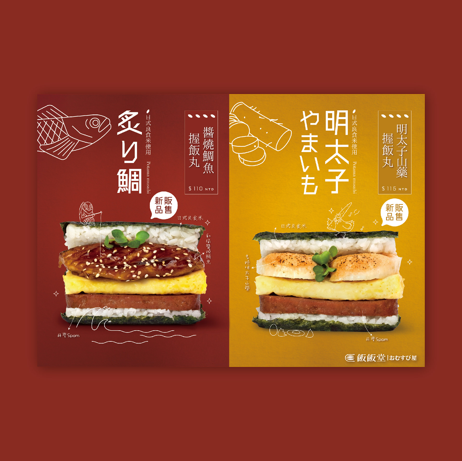
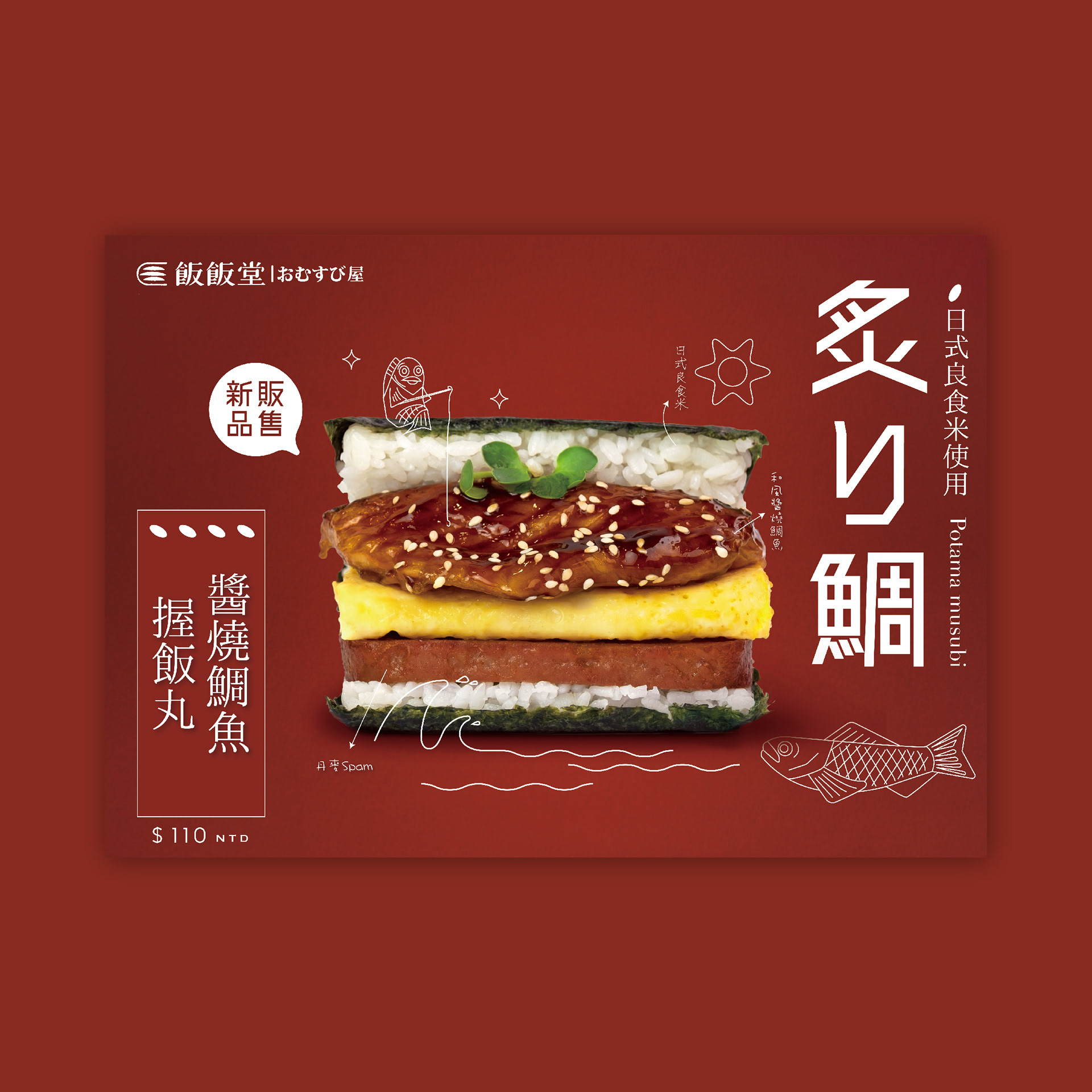
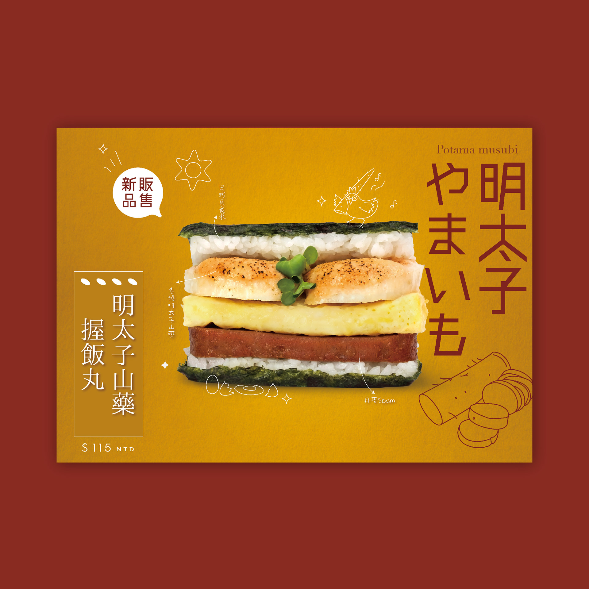
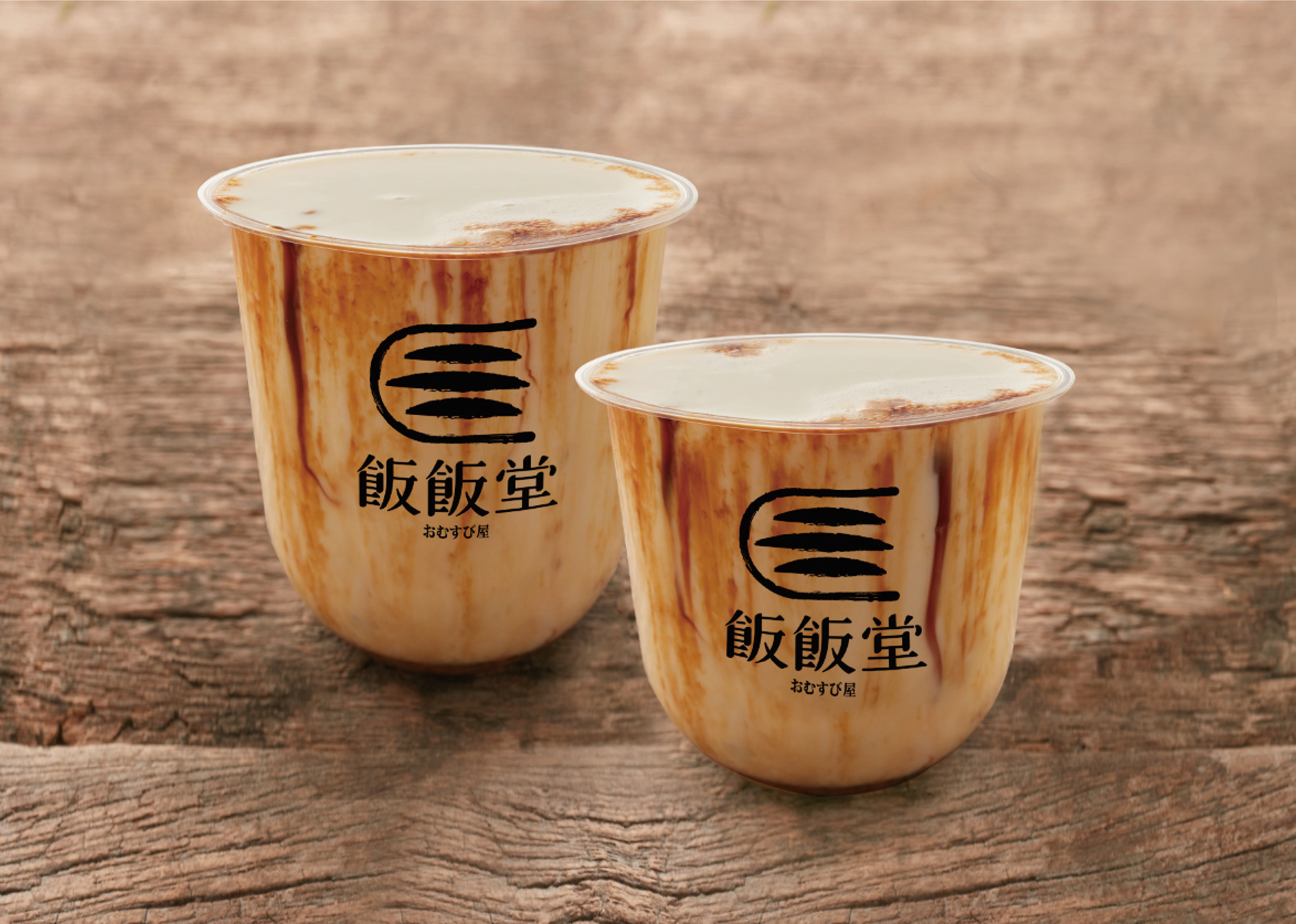
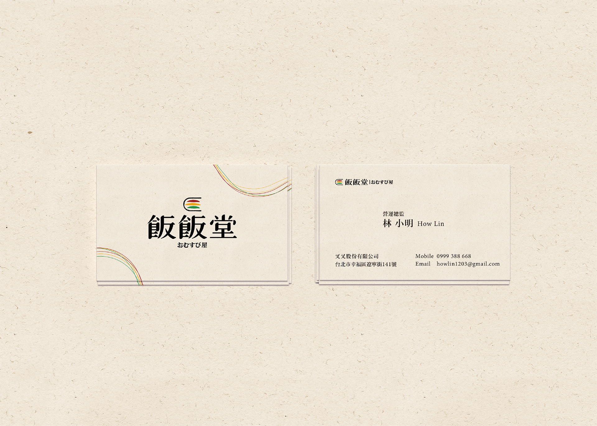
Redeworks 將這套識別系統延伸至飲料包材、單頁菜單、名片與活動海報系列,在不同餐飲接觸點中維持一致的品牌個性,同時保留清楚、直接且適合實際使用的資訊結構。
Fan Fan Tang is a food brand centered around Okinawan-style musubi. Unlike the familiar round rice ball, Okinawan musubi is square in form, combining rice, SPAM luncheon meat, egg and vegetables into a more substantial and satisfying meal.
The brand sought a clean visual presence suited to social media and contemporary food culture. Redeworks developed this clarity while bringing forward the structure of Okinawan musubi, the character of its ingredients and a more crafted, human quality.
The logo is based on the side profile of a musubi wrapped in nori, creating a simple and recognizable brand symbol. Three horizontal colour bands represent SPAM luncheon meat, egg and vegetables, while the ivory tone corresponds to the rice itself. This visual language extends across beverage packaging, a one-page menu, business cards and a series of event posters, creating a consistent identity across different brand touchpoints.